Monday, May 9, 2016

Final

This piece is a self-portrait of the artist.  They used many different colors in a manner that mimics some of Henri Matisse’s early work.  They did not use any natural colors that would have been present in an actual photograph of herself.  She carefully chose an image of herself to be posed like a classical portrait, facing at a slight angle towards the viewer.  Despite this slight angling, the image overall is symmetrical.  The colors are mixed, but repeated on both side of the face.  The background also reflect most of the colors used on the face.  It appears that there are also different shades of the same base colors in the face mixed into the background as well.  These colors are usually richer and darker than the colors on the face.  The differences in the colors play with the space the artist was working with.  The darker colors push the space backward while the lighter color pull it forward.  On the face, this shows clearly which half is facing away from the viewer.  Darker colors create what appears to be shadows along the perimeter of the face.  Outside of the face, the darker and lighter colors do not hold the same logical meaning for the viewer.  They do not form an easily recognizable image, nor do they form one that can be deciphered upon closer study.  They seem to be a mix of colors meant to complement and emphasize the image in the middle through the use of similar yet slightly different colors next to the ones on the face.  This use of different colors without coding a specific meaning to them is similar to Matisse’s Fauvist work.  The unnatural colors change the appearance of the subject matter, but their combination allows the subject to still be easily recognizable to the viewer.  The different colors do not all “go” together or match like one would typically assume colors used together in an image would.  However, the colors still come together to form a logical image because different shades of the same base colors are used and the brush strokes blend some if the colors into each other.
This image is also interesting because it is a self-portrait in an age where traditionally painted portraits are essentially obsolete with the availability of cameras.  Today a proper painting is rarely used, but can still be found depicting important political figures and founders or leaders of institutions of higher education.  The new self-portrait is the selfie.  It is much more accessible to the average person than an old fashioned oil on canvas painting.  This painting is a twist in the selfie.  It hearkens back to the paintings of the past but still works in emulating the selfies that are extremely popular.  The selfie is a new self-expression.  It can convey the takers personality through a calculated presentation of self.  The artist took this to another level by manipulating an image of herself through painting.  The different colors gave her more freedom to choose exactly how she would look in the image.  The fact that this was inspired by Matisse’s Fauvist work means that this piece may have also been exploratory.  Matisse played with colors to see how he would alter an image by changing nature.  The artist here may have been exploring her perceptions of herself through the use of recreating her own image and experimenting with her presentation of self.

Wednesday, April 27, 2016

Intention Statement

With this response project, I hope to explore color, much like Matisse did during his Fauvist period.  To do this, I will be painting a self portrait (or possibly two).  I hope to do one with bright, rich colors used in some of his later work and one with lighter pastel colors like his early Fauvist work, Femme au chapeau.  I am planning on using gouache or acrylic on bristol.  Through this painting, I am hoping to see what I can get out of it by exploring the colors in relation to myself .  I will be changing the medium that Matisse worked in, partially because I do not have those materials available to me and partially because I would not be comfortable completing a final project with materials I have not had very much experience with in the past.  I will be changing the concept, since a lot of Matisse's Fauvist work focused on landscapes and did not include many self portraits.  I am modernizing his work by making my response a painting of a selfie.  The selfie is in it's own way a kind of modern art that people use as a form of self expression.  I am hoping to merge this together with older forms of self expression in an actual painting.  The project will allow me to explore aspects of myself while also exploring the work and techniques of Matisse.
It is really hard to see, but I have the outline of most of the face done

Sunday, April 3, 2016

Kubler and Byrne

These particular readings felt like some sort of breakthrough for me.  This was not necessarily because I gained some spectacular new insight from reading them, but because I feel like I was not left completely confused when I finished.  I particularly enjoyed the Kubler reading.  I thought he made his point rather quickly and effectively without too much "fluffy language."  I think that most problems people face when reading academic articles and excerpts are related to sifting through the elevated language authors employ to make their work fit their academic genre and audience.  Unfortunately, that language usually is not what the typical college student will enjoy.
I really enjoyed reading the entire Kubler article.  I especially liked the beginning when he discussed the way we hail artistic genius.  Fame can be very fleeting, and I am glad he attributed partially to luck.  Art is also very subjective, and just because a very vocal group of people are venerating a particular artist for their work does not mean that their work is seen the same way by everyone.  Similarly, there are many people that are very talented but do not necessarily receive a lot of praise and recognition on a large scale.  They are not hailed as artistic geniuses simply because there are other people are being recognized for the same thing.  For example, I am someone who really enjoys live theater.  Recently, I saw a production of Little Shop of Horrors in Cleveland.  It was put on by our regional theater company, Cleveland Playhouse.  Normally, these shows have much less funding than nationally touring shows and do not have well known casts like Broadway shows do.  These actors receive little national recognition and praise compared to people performing in internationally known theaters on Broadway.  I listened to the soundtrack from the show performed by the Broadway cast, and I did not like it as much as the Cleveland cast.  I thought the Cleveland actors gave the characters more individuality and passion, but that does not mean that they are getting the recognition that I think they deserve.
One point that Kubler made that really struck me was when he mentioned the tendency of people to say that two artists from different schools/movement have nothing to learn from each other.  He says this is an incorrect way to think, and I completely agree with him,  I hate when people act as if different ideas or courses of study cannot coexist and benefit each other.  Especially as an English major, I have heard many people complain about how they have nothing to learn from taking classes on literature.  I truly believe there is something to be learned in all of the different classes we are required to take (but especially in English classes).  Literature lets you learn about the human condition and allows you to see how people interact and relate and think.  I think that is truly valuable no matter what someone chooses to do with their life.

I know I said I was not completely lost with these reading, but I was left with mixed feelings after looking through the Byrne book. As I read the first pages, I thought he was making an interesting point about how mediums like PowerPoint are not completely unbiased because the programming dictates what can and cannot be easily done by the user.  After that, I did not really like it.  The whole book felt chaotic and disorganized.  The minimalist pages with single black and white images were just plain and uninteresting to me.  The pages with a lot of layering of images were so dense that they were difficult to process.  The only section I liked was the chapter/section about faces an the human body.  I thought the close-up pictures of hands and faces looked pretty cool.  Overall, the book was just too much of a mess for me to really enjoy and feel like I gained something from it.

Tuesday, March 15, 2016

Review of Tufte

I feel like I am beginning to sound like a broken record with these reading reviews and responses.  Once again, I do not feel like I am able to fully understand the purpose of the excerpt.  From the beginning, I thought it was going to discuss perspective and the creation of dimension on a flat plane, in which case I would have thought this would have been better to read before beginning the relief project. As I read, I became unsure of what it was trying to communicate.  I had to go back and re-read the whole article to begin to get some sort of idea of what I was supposed to glean from it.  I am glad that I watched the Youtube clip before beginning to read the excerpt.  I liked that the clip discussed different kinds of thinking that need to go into visual information and the different factors that needed to be considered about how the audience will interpret it.  I think that is what the excerpt is trying to discuss as well, just in a much more academic manner. 
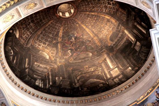
The beginning of the excerpt is a bit misleading.  The discussion of Renaissance architects reminded me of a church I visited during a high school trip to Italy.  Interestingly enough, it was Sant’Ignazio, a church dedicated to the founder of the Jesuits.  What was interesting about the church was the dome, or what appeared to be a dome.  The church did not have enough money t0o build a dome at the time, so a painter decided to make it look like there was one by painting a circle on the ceiling and making the images within in appear to look like they were at a distance like a real dome.  I think the Renaissance painter reference in the excerpt was meant to indicate that the way artists portray visual information has evolved over time since they would flatten out land masses for the sake of maps.
Close up of Sant'Ignazio dome
Dome from afar

I thought it was very interesting that the article discussed that sacrifices must be made to “escape flatland” and enter into a new dimensional plane.  In the case of the dome in Sant’Ignazio, an architectural sacrifice was made but not constructing an actual dome, but the message of the image was still communicated effectively. Besides this, I am still having trouble understanding exactly what the excerpt is saying about visual communication. 
I think that communicating through visual representations of information is very important.  People understand information in many different ways, and some struggle to understand messages when they are communicated solely through words.  Visuals can be very helpful to how connections with information or show groupings of information.  As the excerpt showed, there are some amazingly complex forms of visual communications that can show a large amount of data, such as the large train timetable.  This is likely not meant for the general public.  I think it is very hard to read.  Visual and verbal communication can be integrated to send a more direct message to viewers.  The creator needs to clearly know their audience so that they know how to present their messages.

Wednesday, March 9, 2016

Possible Artists for Research

One of the artists I have thought of researching is Andy Warhol.  Over spring break, I went to the Cleveland Museum of Art.  In the modern art section, there was a large piece by Andy Warhol.  It was 100 portraits of Marilyn Monroe.  Although I am not necessarily a fan of her and all the inspirational quotes incorrectly attributed to her, I do like the high contrast pictures that Warhol used.  I also like that he incorporated pop culture into his art.  I think that it makes his work more accessible to different viewers.  You do not need to search for a deep meaning to appreciate the piece.

Another artists I am considering is Salvador Dali.  I learned about his work in elementary school, and I have some vague distant memories about seeing it referenced in movies in old art classes.  I have also read articles on his perfume collection.  When I went to the Cleveland Museum of Art I also saw one of his pieces.  It caught my eye because the center of the painting appeared to be glowing.  I thought it was the way a light was hitting the frame, but upon closer inspection I saw that it was just the paint.  I thought that was amazing.


The third artist that I am considering is Henri Matisse.  My high school art class looked at some his work when we worked on collages.  I really liked his use of color in his paintings and collages because I think they feel comforting.  I also really enjoy the fluid movement in the dance.  I think his art would be really fun to emulate in my own work.

Friday, February 5, 2016

Two Insights from Berger

Berger's statements at the end of the article regarding the reproduction of art have left me with mixed feelings.  He asserts that reproductions take away the authority of art, and that it can no longer exist in the way that it did in the past.  I do think that art has been completely changed forever because of it's accessibility, which has led to famous work being reinterpreted and reinvented, often for the purpose of humor (warning: this does have some profanity). I am sure this is the kind of thing that would horrify Berger, but I think the reproduction and reinterpretation of art is an amazing thing.  Art has become so accessible for the masses, and everyone can find an appreciation for it in their own way.
Berger also noted that the invention of the camera was one of the major things that forever changed the way art was viewed.  Before, people would need to travel to the place that a painting was located to see it.  This kept the painting in its original context, allowing the viewer see it as it was meant to be seen.  There is some truth to the fact that something is lost when the original context is removed.  The ceiling of Sistine Chapel may still bear religious imagery, but taking it out of a religious setting can totally change the way the viewer looks at it, forcing them to incorporate more of their personal  experiences into their interpretation.