I feel like I am beginning to sound like a broken
record with these reading reviews and responses. Once again, I do not feel like I am able to
fully understand the purpose of the excerpt.
From the beginning, I thought it was going to discuss perspective and
the creation of dimension on a flat plane, in which case I would have thought
this would have been better to read before beginning the relief project. As I
read, I became unsure of what it was trying to communicate. I had to go back and re-read the whole
article to begin to get some sort of idea of what I was supposed to glean from
it. I am glad that I watched the Youtube
clip before beginning to read the excerpt.
I liked that the clip discussed different kinds of thinking that need to
go into visual information and the different factors that needed to be
considered about how the audience will interpret it. I think that is what the excerpt is trying to
discuss as well, just in a much more academic manner.
The beginning of the excerpt is a bit misleading. The discussion of Renaissance architects
reminded me of a church I visited during a high school trip to Italy. Interestingly enough, it was Sant’Ignazio, a church
dedicated to the founder of the Jesuits.
What was interesting about the church was the dome, or what appeared to
be a dome. The church did not have
enough money t0o build a dome at the time, so a painter decided to make it look
like there was one by painting a circle on the ceiling and making the images
within in appear to look like they were at a distance like a real dome. I think the Renaissance painter reference in the
excerpt was meant to indicate that the way artists portray visual information has
evolved over time since they would flatten out land masses for the sake of
maps.
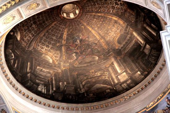 |
| Close up of Sant'Ignazio dome |
 |
| Dome from afar |
I thought it was very interesting that the article
discussed that sacrifices must be made to “escape flatland” and enter into a
new dimensional plane. In the case of
the dome in Sant’Ignazio, an architectural sacrifice was made but not
constructing an actual dome, but the message of the image was still
communicated effectively.
I think that communicating through visual
representations of information is very important. People understand information in many
different ways, and some struggle to understand messages when they are
communicated solely through words. Visuals
can be very helpful to how connections with information or show groupings of
information. As the excerpt showed,
there are some amazingly complex forms of visual communications that can show a
large amount of data, such as the large train timetable. This is likely not meant for the general
public. I think it is very hard to
read. Visual and verbal communication
can be integrated to send a more direct message to viewers. The creator needs to clearly know their
audience so that they know how to present their messages.
No comments:
Post a Comment